From Static Mark to Living System: Testing a logo with animation
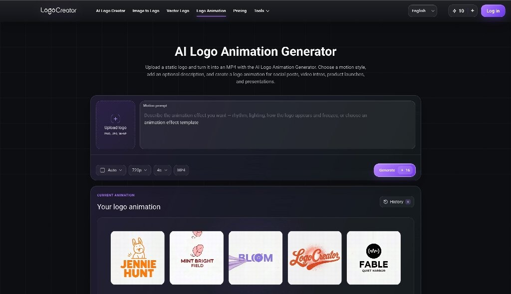
A static logo may work well on a website header, business card, or product label, yet feel strangely passive when it appears inside a video. Motion changes the context. The viewer is no longer looking at a finished mark; they are watching a sequence unfold. That shift creates an opportunity to express timing, personality, and brand behavior, but it also introduces new ways for the identity to lose clarity. The most useful way to evaluate a logo with animation is through a controlled before-and-after process. Start with the approved static asset, define what must remain recognizable, and compare motion versions against the same practical criteria. A logo with animation should not merely look more energetic. It should preserve the original identity while adding a repeatable behavior that improves how the brand enters, exits, or transitions within real content.
Establish the Static Baseline Before Adding Motion
Every motion experiment needs a reference point. Collect the primary logo, compact mark, monochrome version, spacing rules, and smallest approved size. Note which visual feature carries recognition: the wordmark, a distinctive silhouette, negative space, a color relationship, or a particular letterform. Without this baseline, a team may approve a logo with animation that feels exciting as a clip but no longer behaves like the identity people already know.
Create a simple static scorecard before opening any animation tool. Rate the mark for readability, balance, distinctiveness, and flexibility across common backgrounds. This scorecard becomes the control group. The same qualities should be checked again after motion is added, making the comparison more useful than a general reaction such as “the animated one feels better.”
Identify the Non-Negotiable Recognition Cues
Choose two or three elements that cannot be distorted beyond recognition. A monogram may depend on a precise overlap. A wordmark may rely on consistent letter spacing. An emblem may need its outer shape to remain intact. A successful logo with animation can transform, assemble, reveal, or respond, but it should return to the approved static form without visual ambiguity.
It helps to capture the first and final frames as still images. The first frame sets the entry condition; the final frame proves whether the motion resolves cleanly. If the final frame of a logo with animation differs from the official artwork, the animation may create a parallel identity rather than extend the existing one.
Define the Job of the Sequence
Motion should solve a specific communication problem. It may introduce a product video, close a tutorial, separate chapters, acknowledge an interaction, or create a recognizable social signature. Each job suggests a different pace and level of emphasis. A logo with animation used as a short interface response should behave differently from a cinematic reveal at the end of a launch film.
Write the intended job in one sentence and keep it beside the storyboard. This prevents a logo with animation from collecting effects that do not support the use case. The clearer the job, the easier it becomes to compare alternative versions.
Build a Before-and-After Test Instead of a Showreel
A showreel encourages teams to admire polish, music, and visual spectacle. A controlled test makes the underlying identity easier to judge. Place the static logo and the logo with animation in the same frame size, on the same background, and for the same total viewing time. Remove sound during the first review so that audio does not hide weak timing or unclear movement.
Prepare three motion routes rather than dozens of unrelated effects. One route might reveal the mark through its natural geometry. Another might assemble separate elements into the final form. A third might use a restrained scale or opacity change. The purpose is to test meaningful behaviors, not to create a catalog of transitions.
Compare Recognition at Key Moments
Pause each logo with animation version at the first quarter, midpoint, and final frame. At every checkpoint, ask whether viewers can still identify the brand and understand the direction of the sequence. A logo with animation may look smooth at full speed while producing confusing intermediate shapes. Those shapes matter because autoplay delays, dropped frames, and quick scrolling can expose only part of the motion.
Use the same review questions for every route:
- What element attracts attention first?
- When does the brand become recognizable?
- Does the final mark match the static source?
- Would the sequence still make sense without sound?
Record answers separately before discussing preferences. This keeps the logo with animation review focused on observable behavior rather than group enthusiasm.
Measure What Motion Adds—and What It Removes
Motion can add rhythm, anticipation, transformation, or a sense of completion. It can also remove clarity by hiding the name too long, breaking the silhouette, or introducing details that disappear at small size. Compare the benefits and costs directly. If a logo with animation adds personality but delays recognition, shorten the setup. If it improves memorability but feels too playful, adjust the easing and reduce the bounce.
Test the Result in Real Publishing Conditions
A logo with animation approved on a clean editing canvas may behave differently inside an actual video, mobile feed, event screen, or product interface. Insert the logo with animation into representative content before finalizing it. Check the surrounding cut, background contrast, caption placement, and time available for the final frame to settle.
Review vertical, square, and horizontal compositions. A wide movement path can be cropped on mobile, while a centrally balanced sequence may adapt more easily. Test light, dark, and visually busy footage. A logo with animation should keep its essential shape visible even when the background is not ideal.
Turn the Winning Version Into a Motion Rule
Once the comparison identifies the strongest route, document why it works. Describe the order of movement, typical duration, easing character, background rules, safe area, and required final-frame hold. State which elements may be shortened and which recognition cues must remain unchanged. This turns a one-off logo with animation into a reusable part of the identity system.
Create a small set of approved durations rather than allowing every editor to retime the sequence freely. A primary version may suit brand films, while a compact version works for social clips or transitions. Both should share the same core movement logic. Consistency is what helps a logo with animation become recognizable over repeated use.
The final before-and-after review should return to the original scorecard. Confirm that readability, balance, distinctiveness, and flexibility remain at least as strong as they were in the static baseline. Then ask what new quality the movement contributes. If the answer is specific and useful—such as clearer transformation, a stronger sense of completion, or a more consistent video signature—the animation has earned its place.
A logo with animation works best when motion is treated as a design decision, not an upgrade applied automatically. By preserving non-negotiable cues, testing a few purposeful routes, reviewing intermediate frames, and comparing real publishing contexts, small teams can see exactly what the sequence adds. The result is a logo with animation that feels connected to the static identity, performs reliably across content, and gives the brand a motion behavior that others can repeat without reinventing it.